Navigation
열기 닫기
1.1
[스킨 관리 > PC 서브 스킨 ] 소스를 수정해주세요.
<div id="sub_view"> <div id="header" cond="!$app_conn_yn"> <div class="gnb_p"> ... </div>
<div class="inner"> ... </div>
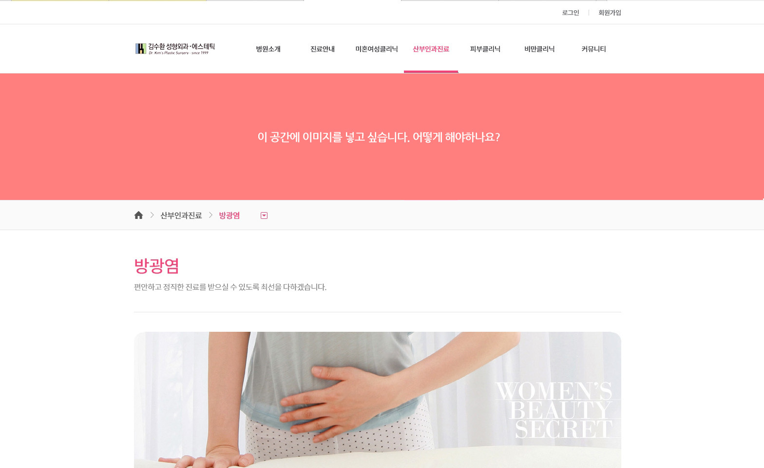
<div class="inner2"> 여기에 이미지를 넣어주세요. </div> </div>
1.2
[스킨 관리 > PC 서브 스킨 > CSS소스] 에서 다음 css 를 수정해주세요.
pc_skin_837_315.css
#header {position:relative;z-index:200;border-bottom:1px solid #e1e4e8;background:#ffffff;} #header .logo h1 {width:100%;margin:0;padding:0 60px;font-size:0;box-sizing:border-box;} #header .logo h1 span {display:table;width:100%;table-layout:fixed;} #header .logo h1 span a {display:table-cell;height:50px;vertical-align:middle;text-align:center;} #header .logo h1 img {width:auto;max-height:30px;} #header .logo button {position:absolute;top:0;bottom:0;width:50px;height:50px;margin:auto;border:none;background:none;font-size:0;cursor:pointer;} #header .logo button:before {font-family:'icomoon';position:absolute;top:0;right:0;bottom:0;left:0;margin:auto;color:#f14378;} #header .logo #toggle_left {left:0;} #header .logo #toggle_left:before {content:'\e902&#**;;width:**px;height:**px;font-size:**px;line-height:**px;} #header .logo #toggle_right {right:0;} #header .logo #toggle_right:before {content:'\e905';width:28px;height:28px;font-size:22px;line-height:28px;}
#sub_view #header > .inner2 { 모바일 CSS 를 추가해주세요. }
...
/* PC CSS */ @media all and (min-width:1024px){
#header .logo {float:left; width:200px;} #header .logo h1{width:auto;padding:0;} #header .logo h1 span{width:auto;} #header .logo h1 span a{height:100px;} #header .logo h1 img {max-height:80px;} #header > .inner{position:relative;} #header > .inner:after {content:''; display:block; clear:both;}
#sub_view #header > .inner2 { PC CSS 를 추가해주세요. }
2.
[스킨 관리 > PC 메인 스킨 > CSS소스] 에서 다음 css 를 수정해주세요.
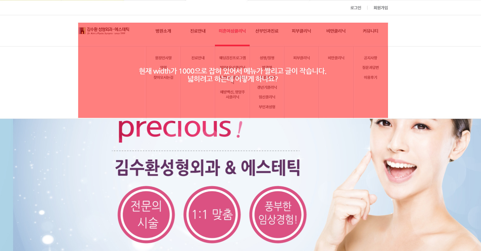
/* PC 화면 넓이값을 가진 센터유지 */ #header > .inner, #lnb_p, .gnb_p > .inner, .sub_location > ul, .shgroup .sub_top_title_wrap, #footer .fnb .fnb_inner, #footer .finfo, .contents_wrap.mypage {margin:0 auto;max-width:1000px;}
.lnb_p {display:block;float:right;width:780px; min-height:100px;margin:0 auto;}
->
/* PC 화면 넓이값을 가진 센터유지 */ #lnb_p, .gnb_p > .inner, .sub_location > ul, .shgroup .sub_top_title_wrap, #footer .fnb .fnb_inner, #footer .finfo, .contents_wrap.mypage {margin:0 auto;max-width:1000px;} #header > .inner {max-width:1000px;}
열기 닫기
1.1
[스킨 관리 > PC 서브 스킨 ] 소스를 수정해주세요.
<div id="sub_view">
<div id="header" cond="!$app_conn_yn">
<div class="gnb_p">
...
</div>
<div class="inner">
...
</div>
<div class="inner2">
여기에 이미지를 넣어주세요.
</div>
</div>
1.2
[스킨 관리 > PC 서브 스킨 > CSS소스] 에서 다음 css 를 수정해주세요.
pc_skin_837_315.css
#header {position:relative;z-index:200;border-bottom:1px solid #e1e4e8;background:#ffffff;}
#header .logo h1 {width:100%;margin:0;padding:0 60px;font-size:0;box-sizing:border-box;}
#header .logo h1 span {display:table;width:100%;table-layout:fixed;}
#header .logo h1 span a {display:table-cell;height:50px;vertical-align:middle;text-align:center;}
#header .logo h1 img {width:auto;max-height:30px;}
#header .logo button {position:absolute;top:0;bottom:0;width:50px;height:50px;margin:auto;border:none;background:none;font-size:0;cursor:pointer;}
#header .logo button:before {font-family:'icomoon';position:absolute;top:0;right:0;bottom:0;left:0;margin:auto;color:#f14378;}
#header .logo #toggle_left {left:0;}
#header .logo #toggle_left:before {content:'\e902&#**;;width:**px;height:**px;font-size:**px;line-height:**px;}
#header .logo #toggle_right {right:0;}
#header .logo #toggle_right:before {content:'\e905';width:28px;height:28px;font-size:22px;line-height:28px;}
#sub_view #header > .inner2 {
모바일 CSS 를 추가해주세요.
}
...
/* PC CSS */
@media all and (min-width:1024px){
...
#header .logo {float:left; width:200px;}
#header .logo h1{width:auto;padding:0;}
#header .logo h1 span{width:auto;}
#header .logo h1 span a{height:100px;}
#header .logo h1 img {max-height:80px;}
#header > .inner{position:relative;}
#header > .inner:after {content:''; display:block; clear:both;}
#sub_view #header > .inner2 {
PC CSS 를 추가해주세요.
}
2.
[스킨 관리 > PC 메인 스킨 > CSS소스] 에서 다음 css 를 수정해주세요.
pc_skin_837_315.css
/* PC CSS */
@media all and (min-width:1024px){
...
/* PC 화면 넓이값을 가진 센터유지 */
#header > .inner, #lnb_p, .gnb_p > .inner, .sub_location > ul, .shgroup .sub_top_title_wrap,
#footer .fnb .fnb_inner, #footer .finfo, .contents_wrap.mypage {margin:0 auto;max-width:1000px;}
...
.lnb_p {display:block;float:right;width:780px; min-height:100px;margin:0 auto;}
->
/* PC CSS */
@media all and (min-width:1024px){
...
/* PC 화면 넓이값을 가진 센터유지 */
#lnb_p, .gnb_p > .inner, .sub_location > ul, .shgroup .sub_top_title_wrap,
#footer .fnb .fnb_inner, #footer .finfo, .contents_wrap.mypage {margin:0 auto;max-width:1000px;}
#header > .inner {max-width:1000px;}
...
.lnb_p {display:block;float:right;width:780px; min-height:100px;margin:0 auto;}