애니빌드.LAB
토론방
소스관련 모바일 버전 문의
- r**utie
- 2017-10-27 17:47:44
- hit3232
- http://lab.anybuild.co.kr/bbs/qna/6864
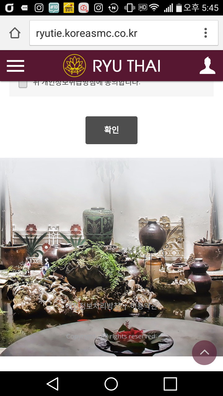
모바일에서 보면 아래 캡처화면 처럼 하단 배경이미지에 흰색 여백이 확인됩니다.
여백 없이 출력되게 하는 방법 문의 드립니다.
게시글 공유
URL복사
댓글작성
열기 닫기
열기 닫기
모바일 버전에서는 정상적으로 출력되는걸 확인했는데
수정 이후 PC에서 화면이 27인치 모니터에서 확인하면
그라데이션 준 이미지 부분이 짤려서 확인됩니다.
이부분 확인 부탁드립니다.
[스킨 관리 > PC 메인 스킨 > CSS 수정 > pc_skin_857_532.css] 에서 다음을 수정하였습니다.
- 모바일일 경우 : 아래부터 출력
- PC일 경우 : 위에서부터 출력
#container .contents_wrap{min-height:350px;}
#container .contents:after{content:'';display:block;overflow:hidden;clear:both;}
#sub_view #container .contents_wrap{padding:0 0 20px;}
#sub_view #container .contents_wrap .contents{padding-top:20px;}
#footer {overflow:hidden;position:relative; padding:220px 5px 20px; background:url(/img_up/shop_pds/ryutie/build/option/main_footer_bg1509092563.jpg) center bottom no-repeat; background-size:cover; -webkit-box-sizing: border-box; box-sizing: border-box;}
#footer #btn_site_top {position:fixed;bottom:10px;right:10px;z-index:0;width:40px;height:40px;border:none;border-radius:50%;background:#571730;font-size:0;opacity:0;transition:all .2s ease-in-out;-o-transition:all .2s ease-in-out;-ms-transition:all .2s ease-in-out;-moz-transition:all .2s ease-in-out;-webkit-transition:all .2s ease-in-out;}
#footer #btn_site_top:before {content:'\e917';font-family:'icomoon';font-size:16px;font-weight:bold;color:#fff;}
#footer #btn_site_top.on {opacity:.6;z-index:1000;}
......
/* PC CSS */
@media all and (min-width:102*px){
...
#header{position:absolute; top:0; right:0; left:0; background:none; -webkit-box-shadow:none; box-shadow:none;}
#header > .inner{position:relative; width:1000px; margin:auto; padding:10px;-webkit-box-sizing:border-box;box-sizing:border-box;}
#header > .inner:before {content:''; position:absolute; top:0; right:0; bottom:0; left:0; z-index:10; background:#571730; opacity:.9;}
#header > .inner:after {content:''; display:block; clear:both;}
#header .logo {position:relative; z-index:20; width:200px; height:50px; margin:auto;}
#header .logo h1{width:auto;padding:0;}
#header .logo h1 span{display:inline-block;width:auto;}
#header .logo h1 span a{display:block;}
.fixed #header {position:fixed; top:-40px;}
#footer {padding:350px 10px 20px;}
#footer {background:url(/img_up/shop_pds/ryutie/build/option/main_footer_bg1509092563.jpg) center top no-repeat;} // 추가
.finfo {padding:10px 20px 20px;font-size:0;text-align:center;}
.finfo .f_logo {display:none;}
원래는 27인치에서도 아래 배경이 화면에 딱 맞았는데
현재 이미지가 원본 사이즈대로 출력이됩니다.
확인 부탁드립니다.
27인치 모니터의 해상도를 알려주세요
예) 1920*1080
pc용 CSS 를 다음과 같이 수정하였습니다.
#footer {padding:350px 10px 20px;}
#footer {background:url(/img_up/shop_pds/ryutie/build/option/main_footer_bg1509092563.jpg) center top no-repeat;}
->
#footer {overflow:hidden;position:relative; padding:350px 10px 20px; background:url(/img_up/shop_pds/ryutie/build/option/main_footer_bg1509092563.jpg) center top no-repeat; background-size:cover; -webkit-box-sizing: border-box; box-sizing: border-box;}