애니빌드.LAB
토론방
디자인팜2.0 병원홈페이지 메인 회원가입 버튼 지우기와 홈페이지 서브 이미지 축소에 대해 문의드립니다.
- 신**지
- 2017-11-02 15:25:40
- hit3247
- http://lab.anybuild.co.kr/bbs/qna/6795
(필수) 확인 가능한 전체 URL :
http://www.pskim.co.kr/main
http://haram.namuweb.co.kr/page/page12
11월 2일 오후 3시경에 전화문의 드렸던 사람입니다.
1. 김수환 성형외과 홈페이지
홈페이지 메인에서 맨 위에 있는 로그인, 회원가입 버튼을 햐얗게 만들고자 합니다.
소스를 수정하라고 하셨는데 수정하는 방법을 알려주시면 감사하겠습니다.
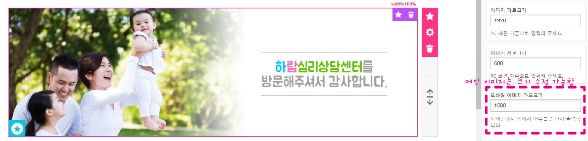
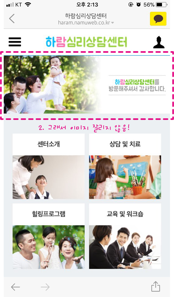
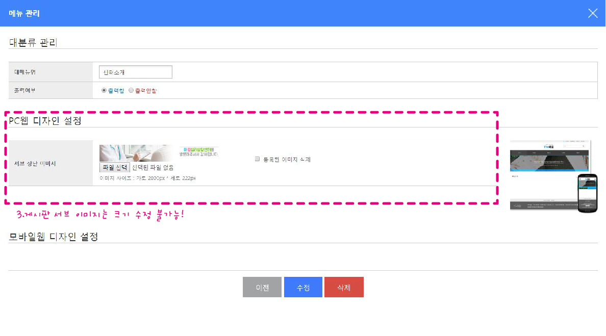
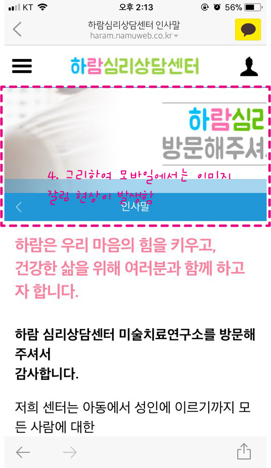
2. 하람심리상담센터
홈페이지 메인 이미지를 모바일에서는 크기를 줄일 수 있지만
게시판을 들어간후 뜨는 서브 이미지 크기를 모바일로 줄일 수 없어 문의 드립니다.
설명이 부족하여 스크린 샷과 함께 보내드립니다.
 |
| 하람 심리상담센터 홈페이지 |
 |
| 하람 심리상담센터 홈페이지 |
 |
| 하람 심리상담센터 홈페이지 |
 |
| 하람 심리상담센터 홈페이지 |
게시글 공유
URL복사
댓글작성
열기 닫기
열기 닫기
1.
디자인팜 접속
-> 스킨관리
-> 사용중인 스킨을 [소스 수정 모드] 로 전환
-> CSS 파일 관리 에서 css 선택
-> 로그인, 회원가입 관련 css 수정
.gnb_p {padding:8px 0; border-bottom:1px solid #e1e4e8;font-size:0;text-align:right;}
.gnb_p .new_date{display:inline-block;padding:0 20px 0 10px;font-size:13px;font-weight:bold;color:#66686e;}
.gnb_p .gnb_list {display:inline-block;margin:0;padding:0;list-style:none;}
.gnb_p .gnb_list li {display:inline-block;position:relative;margin-left:20px;padding-left:20px;}
.gnb_p .gnb_list li:before {content:'';position:absolute;top:0;bottom:0;left:0;width:1px;height:12px;margin:auto;background:#66686e;opacity:.3;}
.gnb_p .gnb_list li:first-child {margin-left:0; padding-left:0;}
.gnb_p .gnb_list li:first-child:before {display:none;}
.gnb_p .gnb_list li a {display:inline-block;height:30px;line-height:30px;font-size:13px;font-weight:bold;color:#66686e;letter-spacing:-.03em;transition:all .3s ease-out;}
.gnb_p .gnb_list li a:hover {color:#f14378;}
.gnb_p .gnb_list li:first-child a:before {display:none;}
2.
디자인팜 접속
-> 스킨관리
-> 사용중인 스킨을 [소스 수정 모드] 로 전환
-> CSS 파일 관리 에서 css 선택
-> 서브 상단 이미지 관련 css 수정
/* 모바일 */
#sub_view #container .navi_img{position:relative;height:150px;}
#sub_view #container .navi_img:after{content:'';display:block;position:absolute;left:0;bottom:0;width:100%;height:20px;background:rgba(33,151,215,0.4);}
#sub_view #container .navi_img img{position:absolute;top:0;left:50%;width:1350px;max-width:none;height:150px;margin-left:-675px;vertical-align:top;}
/* PC */
#sub_view #container .navi_img{position:relative;height:222px;}
#sub_view #container .navi_img img{position:absolute;top:0;left:50%;width:2000px;max-width:none;height:222px;margin-left:-1000px;}]
2번 추가답변)
메인 슬라이드 이미지의 경우 모바일일때 이미지를 자를 수 있도록 프로그램 처리되어 있습니다.
서브 상단 이미지는 세로 높이를 고정하고 좌우를 자동으로 자르게 되어 있습니다.
메인 슬라이드 이미지처럼 모바일 크기를 설정하여 자르려면 html, css 의 추가 수정이 필요합니다.